
A new huge player
Johnson Controls — Hitachi Air Conditioning was established on October 1st, 2015, as a Joint Venture.
Since then, the company has worked to create air conditioning solutions that generate harmony in spaces and in people's lives. A harmony that is born from the balance between opposites.
It's in the contrast between opposing elements that you can find the true essence of the brand:
cooling and heating,
global and born Japanese, generating environments that are artificial making people feel natural, creating systems that are complex to make people’s lives simple, designing high-end technologies according to the needs & desires of people, Johnson Controls — Hitachi Air Conditioning works hard to provide the most cutting-edge function to connect with people’s emotions.
The logo is the symbol that represents the union between two experienced companies, Johnson Controls International plc and Hitachi Global Life Solutions who join forces to evolve into an exciting venture. It combines both companies’ symbols and its composition aims to reflect the balance and harmony that our brand strives to bring to our stakeholders’ lives.
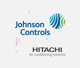


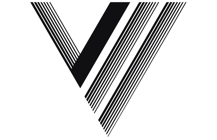
Grid system
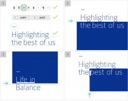
The en-dash
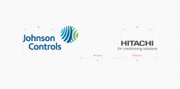
The en-dash is a graphic element whose consistent use can help to strengthen the visual identity and help the audience to create a visual association between the graphic image and Johnson Controls–Hitachi Air Conditioning's brand.
It is always to be used before the main headlines throughout the company’s communication.
Graphic Elements